Alignment tips for your benefits communication design
Are you finding yourself in a rut and aligning everything on the page smack down the center? Sure, this is a foolproof way to achieve balance, and it can look professional, but it can also put your viewers to sleep by creating benefits communication collateral that is rather ho-hum.
Having a better understanding of how to use the design principle of alignment can help wake up your benefits communication collateral and give your pieces a more professional, organized and cohesive look. And it’s easy!
The main concept in alignment is that nothing should ever be arbitrarily placed on the page. Every element should have some visual connection with another element on the page to create a unified whole.
Sounds great. I’m there, so now what?
Quite often designers create a background grid to achieve a more cohesive and dynamic piece. Horizontal and vertical grid lines are set up to create structure. Sometimes items break the grid, but this is an intentional act and is the exception instead of the rule. It’s all a balancing act between creating order and structure without being boring!
You may find that it is best to stick to one type of justification for text on a page. For example, try having your headlines and body copy justified to the left.
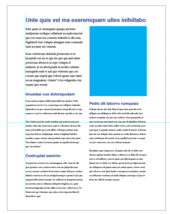
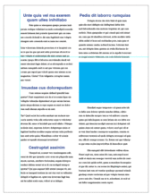
There is, however, a way to mix left-, right- and center-justified text. The secret is to have your text box align with something else on the page, like the edge of an image. In example B, my main text boxes are aligned to the left, but the copy at the bottom is aligned to the right. This copy is also aligned with the picture box above. Keep in mind that your aligned objects don’t have to be close to each other to create a unified feel. Example C uses the same idea.
I’m not saying that you should steer clear of center alignment. It can work just fine if you do so in style and follow these tips:
- Make some of the type smaller or bolder to make it stand out.
- Add additional design elements (sparingly!) such as ornamental flourishes (that’s design-speak for pretty graphic elements).
- Play with the space between lines of text (leading).
- Create a type hierarchy.
Whatever you do, don’t use a standard font like Times. Set everything to 12-point type and use double returns!
Horizontal alignment

 It’s also important to pay attention to how text or images are horizontally aligned. In example D, the headlines are centered while the body copy is aligned to the left with huge typewriter-style indents. The page looks off balance, because there are a lot of strange gaps and awkward spacing.
In Example E, there is a stronger visual hierarchy through the use of a larger headline, subheads and body copy. The headline now runs across the top of the page, so it doesn’t fit awkwardly on two lines. The body copy falls on the same baseline in both columns, creating a more solid structure.
Another tip is to look for strong lines—and use them. This could be the edge of a photo or copy block. To test your structure, print a piece and use a colored pen and straight edge/ruler to see if your items are well aligned on the page.
Good luck and have fun creating more dynamic benefits communication collateral!
Work with Us
We partner with organizations that value their people first. Let’s talk.


