Skip to content
PayPal makes accessing their employee benefits info as easy as making online payments.
 

PayPal, which operates a worldwide online payments system, wanted to update their benefits website to make it as modern and state of the art as they are. Their goal was to offer a fully branded, customized experience that would help their global employees quickly and easily access information about PayPal’s benefits.

 
23,000+ Global employees
305million Active account holders in over 200 markets
$17.77billion Revenue (FY 2019)
paypal-laptop
We are so proud of our website and the fact that we can now offer consistent benefits content to multiple countries. The Segal Benz team has been a pleasure to work with and extremely responsive to all of our needs!”
Andrea Costanzo Paypal Sr. Benefits Program Manager
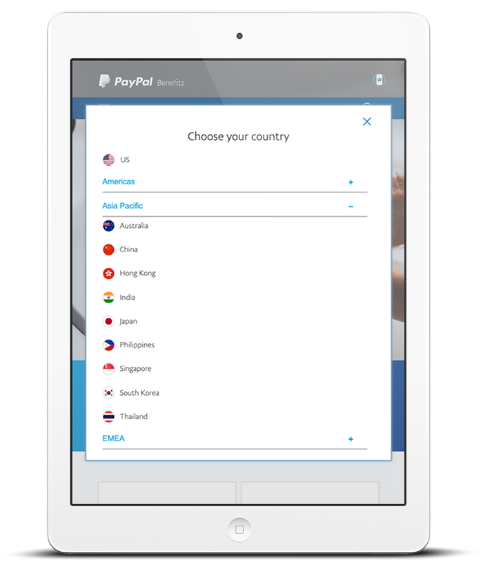
paypal-ipad-country-selector
iphone-mockup-flat_multiple3

Prioritizing the Employee Experience


 At PayPal, employees are asked to help "reimagine money.” This is the primary mission of the company, which prides itself on offering tailored benefits that meet employees’ everyday needs, regardless of which stage of life they’re in. In recent years, however, PayPal had received continuous employee feedback that they—and their family members—didn’t know about all the benefits available to them. This meant employees weren’t reaping the rewards of PayPal’s diverse benefits program. After a thorough review, PayPal concluded that their benefits website didn’t align with the cultural values of “collaboration, innovation, wellness, and inclusion,” principles the company uses in guiding business decisions.

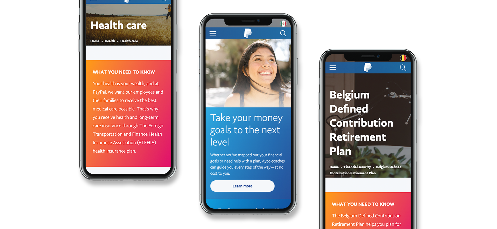
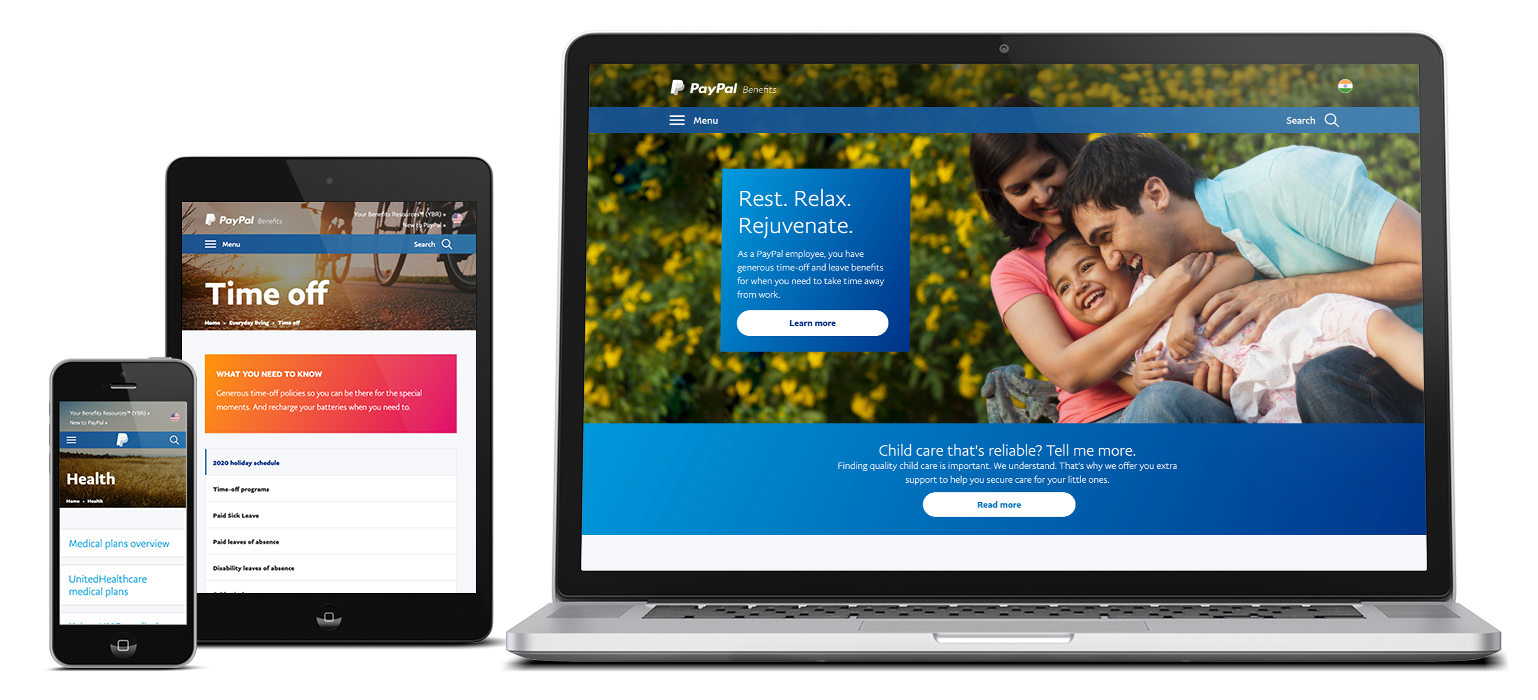
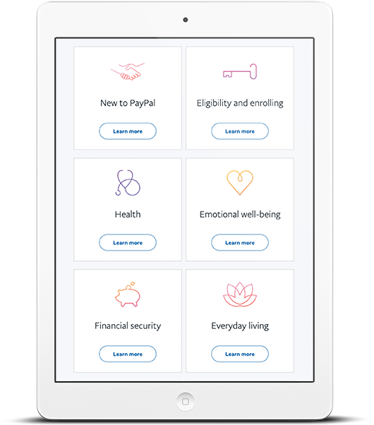
 Another issue: The benefits site wasn’t set up for a global workforce, so they had no reliable system to provide consistent benefits information to their employees outside the U.S. They also wanted a site that put the mobile-user experience at the forefront, since many of their employees rely on a mobile device for information. Additionally, the new site needed to be easy to navigate, maintain a consistent brand and voice reflective of PayPal’s culture, and be the central spot to house global benefits information. And, of course, the new site had to feature a sleek, modern, on-brand design to provide the kind of stellar—and seamless—user experience their own customers encounter.

 
paypal-3device-mockup

What We Set Out to Do

The new PayPal benefits website had to achieve three main goals:

  1. Feature accurate, clear, and reader-friendly content for all their countries that aligns with the company’s business goals, objectives, and desired outcomes.
  2. Use content and images that are customized for each country, based on regional cultural norms.
  3. Be open access, so all information is available to employees, family members, recruiters, and prospective employees.

A Website Reinvented

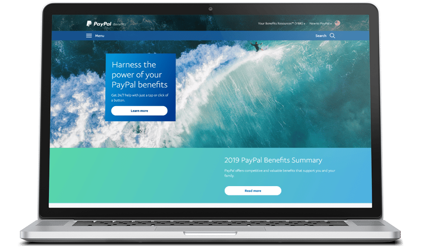
In July 2018, PayPal launched their fully redesigned, branded, customized, and mobile-optimized benefits website—paypalbenefits.com—for their U.S. employees. They used employee-facing communications to promote the site as the one-stop resource for all benefits-related information. The site has since been expanded to include countries beyond the U.S., with Segal Benz launching customized PayPal benefits websites for employees in 29 countries.

More Clicks = A More Engaged Workforce

The benefits website continues to gain traction since its launch in the U.S. and with each additional country that goes live. Since its 2018 launch, the site has attracted nearly 200,000 users who have visited over 280,000 times and have viewed the site pages over 900,000 times. Over a quarter of site visits are via a mobile device.

paypal-ipad